HTML5教程
【端午节】用html和css写一个可爱的粽子

端午佳节已过,思考再三,决定把发在公众号上的文章搬过来!正文如下:
吃着香喷喷的粽子,灵感一来,突然决定用纯前端写一个可爱的粽子出来。
说干就干,开整!
第一步,写一个粽子的身体
首先,我们先创建一个 div\color{red}divdiv 元素:
<div class="zongzi"></div>
我在这里特意有道查了一下粽子的英语,原来国外把粽子叫做“传统的中国米饭布丁”,英文是 TraditionalChineserice−pudding\color{red}Traditional Chinese rice-puddingTraditionalChineserice−pudding。这也太复杂了,于是问了曾经教英语的外教老师,他说现在也是直接说中文拼音 zongzi\color{red}zongzizongzi ,于是就用 zongzi\color{red}zongzizongzi 作为粽子身体的 class\color{red}classclass 值。
给这个元素设置宽度和高度,以及背景图:
.zongzi {
  width: 650px;
  height: 600px;
  background: #ffedc8;
}
为了显示方便,使用定位将其放到屏幕中间:
.zongzi {
  position: fixed;
  top: 0;
  right: 0;
  bottom: 0;
  left: 0;
  width: 650px;
  height: 600px;
  background: #ffedc8;
  margin: auto;
}
这样,我们在页面正中间写了一个糯米色的盒子: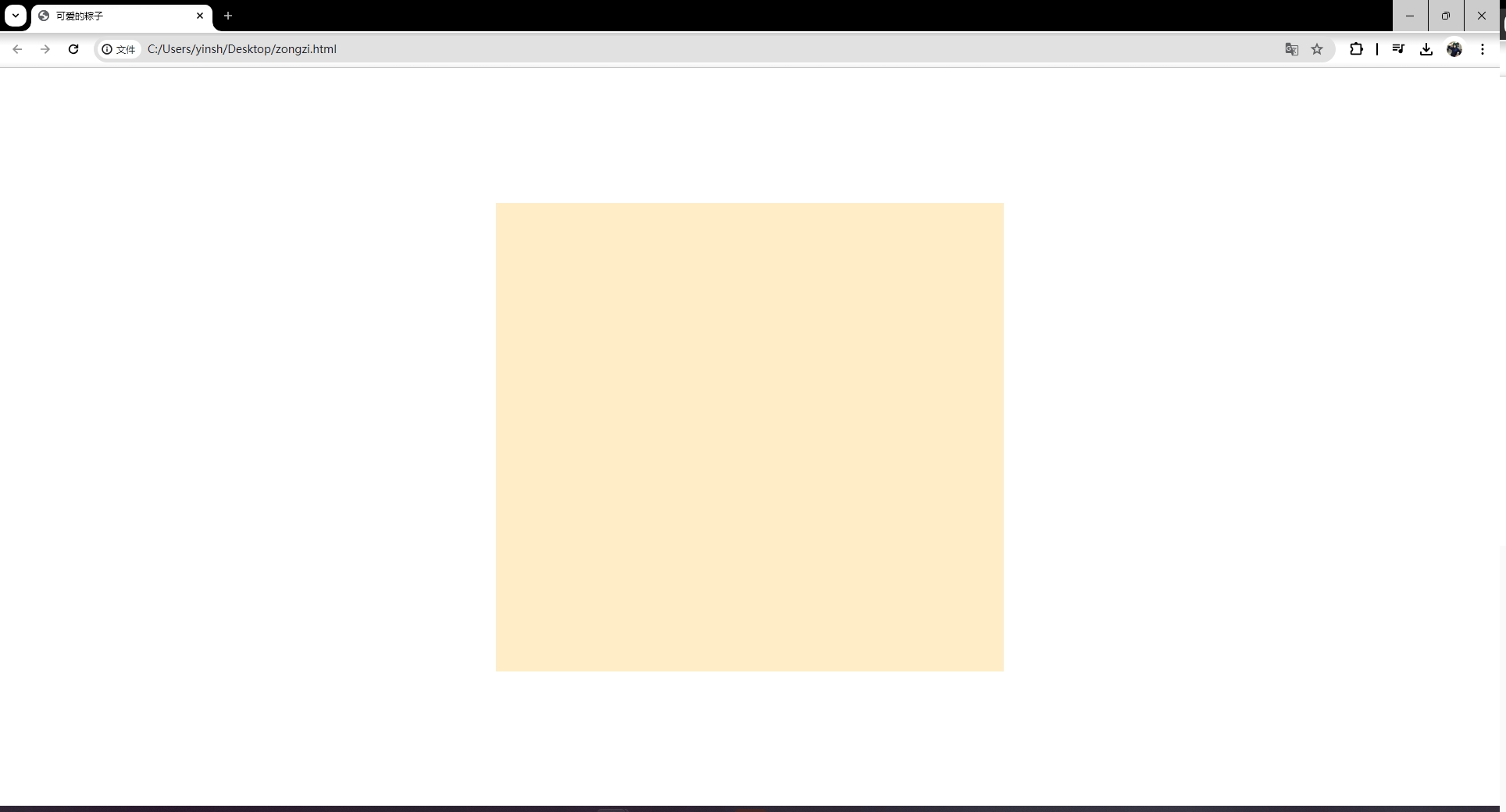
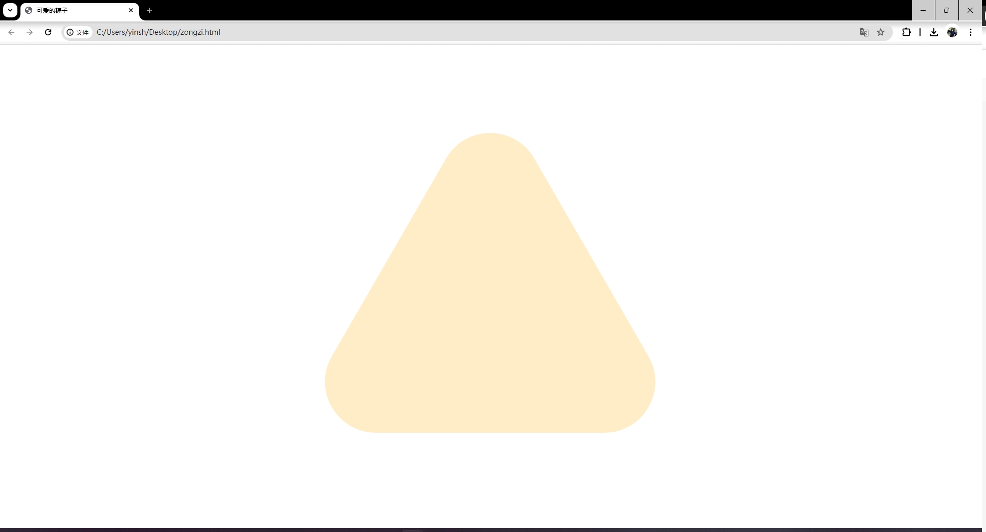
粽子是三角形的,而且还是圆角三角形的。需要使用 clip-path 属性将其裁剪为一个圆角三角形:
clip-path: path("M100.1,586.4c-36,0-68.2-18.6-86.2-49.8c-18-31.2-18-68.3,0-99.5L237.3,50.2c18-31.2,50.2-49.8,86.2-49.8c36,0,68.2,18.6,86.2,49.8l223.4,386.9c18,31.2,18,68.3,0,99.5c-18,31.2-50.2,49.8-86.2,49.8H100.1z");
path\color{red}pathpath 的值拿走不谢,想知道如何写出来的,我会在未来陆续推出 SVG\color{red}SVGSVG 教程,届时大家就知道了。
至此,咱们已经写出一个粽子的身体了。
第二步,写出粽子的粽叶
由于粽叶也是沿着粽子的轮廓而成,我们将其放到 zongzi\color{red}zongzizongzi 的 div\color{red}divdiv 中,这样就不需要写更多的 clip−path\color{red}clip-pathclip−path 了。
<div class="zongzi">
  <div class="leaf-right"></div>
  <div class="leaf-left"></div>
</div>
先控制粽叶的大小、颜色和边框:
.leaf-left,
.leaf-right {
  position: absolute;
  right: 0;
  bottom: 0;
  left: 0;
  width: 650px;
  height: 300px;
  background: linear-gradient(
    #87d15d 19%,
    #49912c 20%,
    #87d15d 21%,
    #87d15d 39%,
    #49912c 40%,
    #87d15d 41%,
    #87d15d 59%,
    #49912c 60%,
    #87d15d 61%
  );
  margin: auto;
  border-top: 5px solid #49912c;
}
这里,粽叶的颜色,采用了线性渐变的方式,让其显示绿色粽叶上有深绿色线条,效果更甚。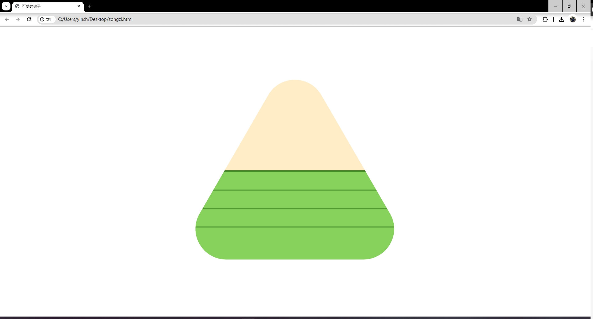
我相信细心的你已经发现了,我写了 leaf−right\color{red}leaf-rightleaf−right 和 leaf−left\color{red}leaf-leftleaf−left 两片粽叶,现在却重叠在一起了。于是我们将其分开:
.leaf-left {
  transform: rotate(30deg) translate(0, 100px);
}
.leaf-right {
  transform: rotate(-30deg) translate(0, 100px);
}
通过两个对称角度的旋转,得到粽叶包裹的效果: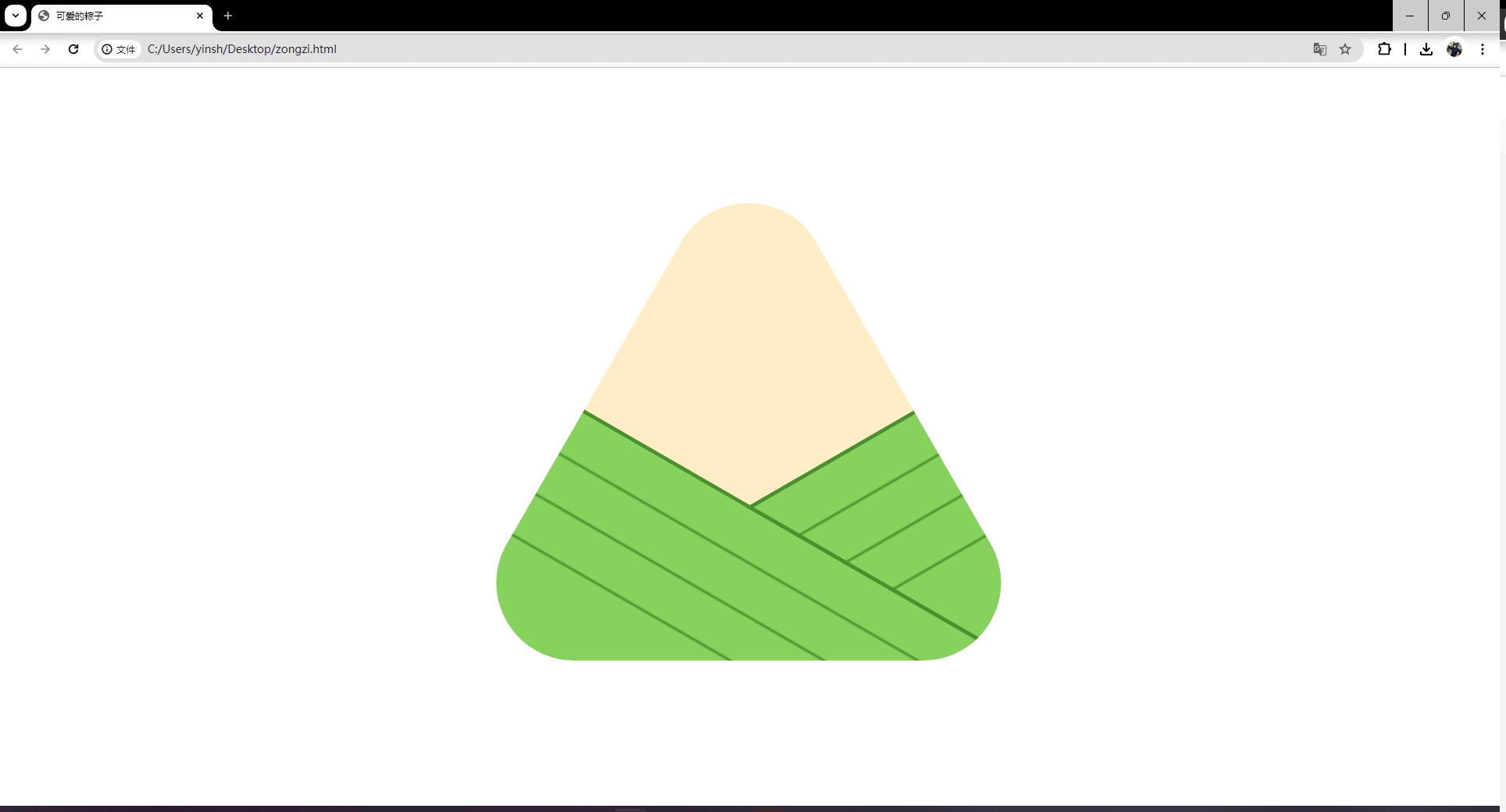
至此,一个粽子就写出来了。
别急,继续往下看......
第三步,两只眼睛
咱们给粽子一个生命,就加上一张笑脸吧。
先添加两只眼睛:
<div class="zongzi">
  <div class="eye-left"></div>
  <div class="eye-right"></div>
  <div class="leaf-right"></div>
  <div class="leaf-left"></div>
</div>
控制眼睛的位置、大小:
.eye-left,
.eye-right {
  position: absolute;
  top: 100px;
  width: 50px;
  height: 100px;
  background: #333;
}
.eye-left {
  left: 250px;
}
.eye-right {
  right: 250px;
}
通过分别控制左眼和右眼的位置之后,得到一双眼睛: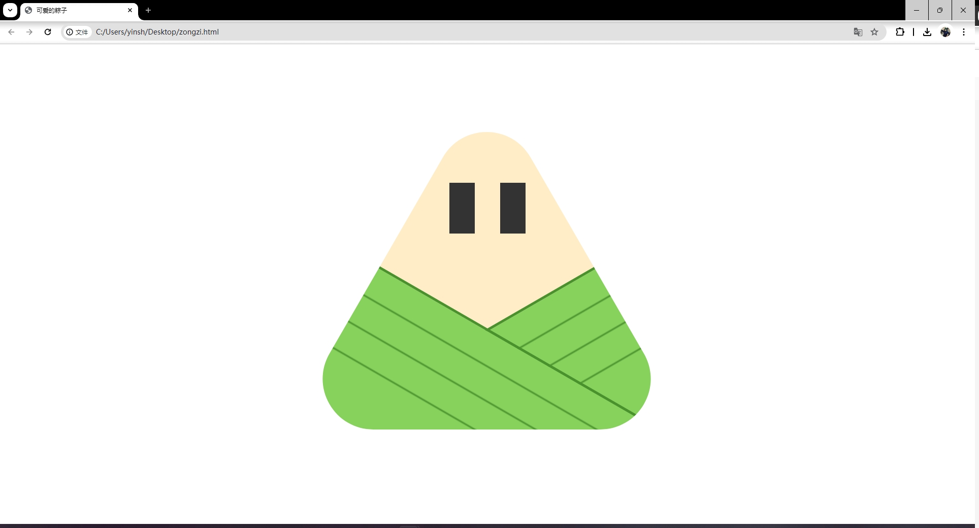
妈呀,这是啥呀,吓死我了( ̄▽ ̄)"…
首先,让眼睛变成圆形,添加 border−radius\color{red}border-radiusborder−radius 属性:
.eye-left,
.eye-right {
  position: absolute;
  top: 100px;
  width: 50px;
  height: 100px;
  background: #333;
  border-radius: 50%;
}
.eye-left {
  left: 250px;
}
.eye-right {
  right: 250px;
}
得到如下结果:
然后,我们再如法炮制,使用每一只眼睛的伪元素给眼睛添加眼珠子:
.eye-left::before,
.eye-right::before {
  position: absolute;
  top: 0;
  right: 0;
  bottom: 0;
  display: block;
  width: 15px;
  height: 30px;
  background: #fff;
  margin: auto;
  border-radius: 50%;
  content: "";
}
使用伪元素可以减少HTML的结构: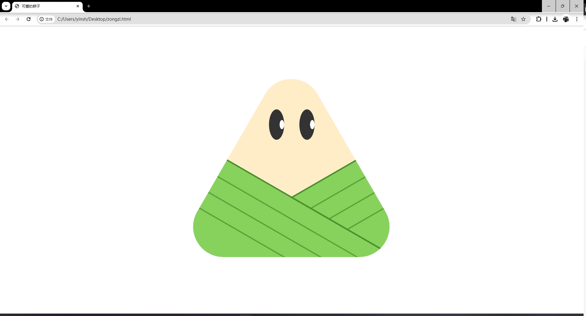
至此,两只眼睛都写出来了。
别急嘛,一张笑脸怎么可以少了嘴巴呢?
第四步,弯弯小嘴
咱们再写一个 div\color{red}divdiv 来做嘴巴:
<div class="zongzi">
  <div class="eye-left"></div>
  <div class="eye-right"></div>
  <div class="mouth"></div>
  <div class="leaf-right"></div>
  <div class="leaf-left"></div>
</div>
和眼睛一样,通过CSS控制嘴巴的位置、大小、边框、形状等:
.mouth {
  position: absolute;
  top: 200px;
  right: 0;
  left: 0;
  width: 100px;
  height: 100px;
  margin: auto;
  border-bottom: 5px solid #333;
  border-radius: 50%;
}
这样,就得到了一个可爱的粽子: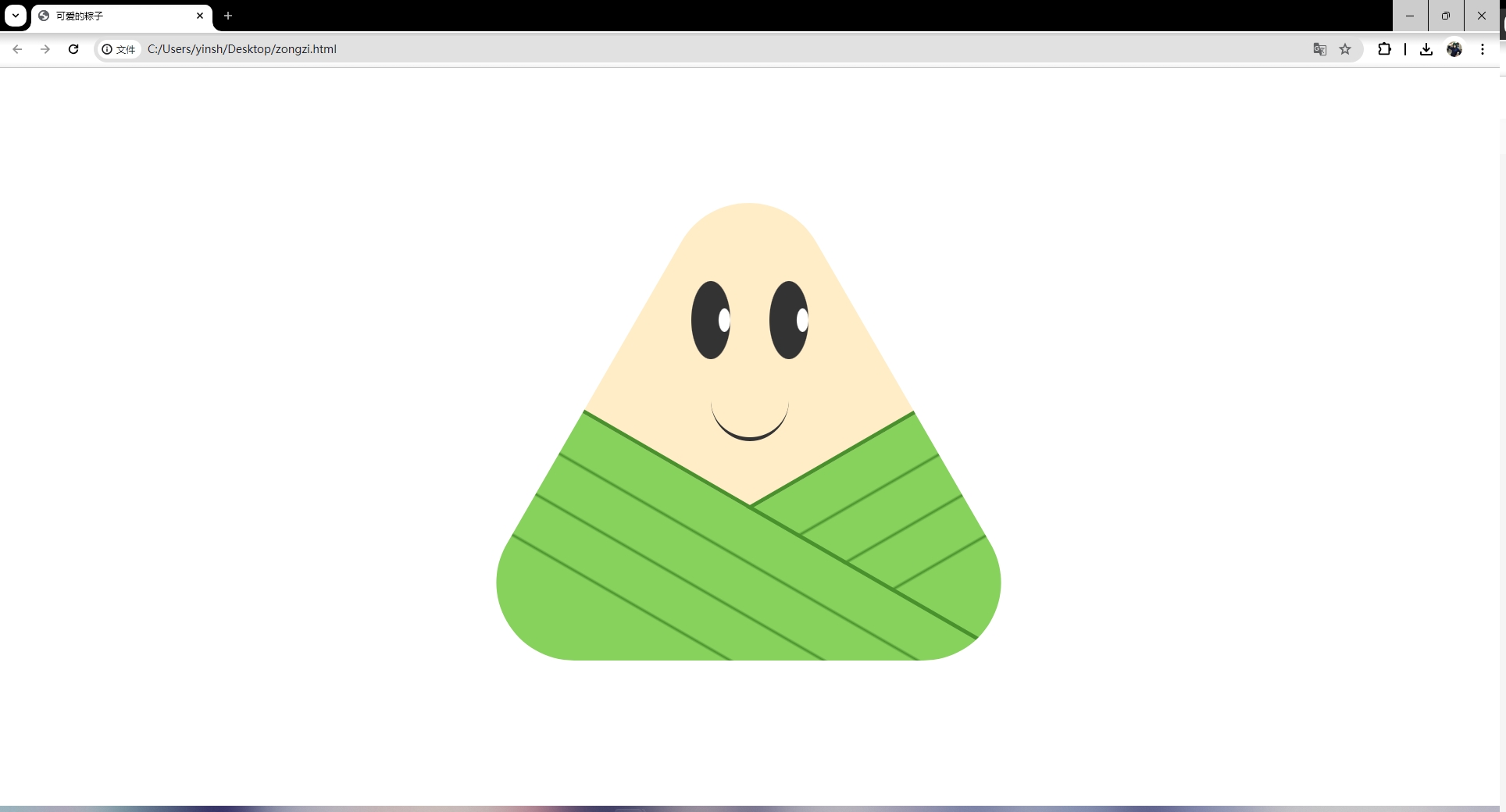
至此,咱们的可爱的粽子就写出来了。O(∩_∩)O
完整代码
这里,附上完整的源代码,拿走不用谢:
<!DOCTYPE html>
<html lang="en">
<head>
<meta charset="UTF-8" />
<meta name="viewport" content="width=device-width, initial-scale=1.0" />
<title>可爱的粽子</title>
<style type="text/css">
  .zongzi {
    position: fixed;
    top: 0;
    right: 0;
    bottom: 0;
    left: 0;
    width: 650px;
    height: 600px;
    background: #ffedc8;
    margin: auto;
    clip-path: path(
      "M100.1,586.4c-36,0-68.2-18.6-86.2-49.8c-18-31.2-18-68.3,0-99.5L237.3,50.2c18-31.2,50.2-49.8,86.2-49.8c36,0,68.2,18.6,86.2,49.8l223.4,386.9c18,31.2,18,68.3,0,99.5c-18,31.2-50.2,49.8-86.2,49.8H100.1z"
    );
  }
  .eye-left,
  .eye-right {
    position: absolute;
    top: 100px;
    width: 50px;
    height: 100px;
    background: #333;
    border-radius: 50%;
  }
  .eye-left {
    left: 250px;
  }
  .eye-right {
    right: 250px;
  }
  .eye-left::before,
  .eye-right::before {
    position: absolute;
    top: 0;
    right: 0;
    bottom: 0;
    display: block;
    width: 15px;
    height: 30px;
    background: #fff;
    margin: auto;
    border-radius: 50%;
    content: "";
  }
  .mouth {
    position: absolute;
    top: 200px;
    right: 0;
    left: 0;
    width: 100px;
    height: 100px;
    margin: auto;
    border-bottom: 5px solid #333;
    border-radius: 50%;
  }
  .leaf-left,
  .leaf-right {
    position: absolute;
    right: 0;
    bottom: 0;
    left: 0;
    width: 650px;
    height: 300px;
    background: linear-gradient(
      #87d15d 19%,
      #49912c 20%,
      #87d15d 21%,
      #87d15d 39%,
      #49912c 40%,
      #87d15d 41%,
      #87d15d 59%,
      #49912c 60%,
      #87d15d 61%
    );
    margin: auto;
    border-top: 5px solid #49912c;
  }
  .leaf-left {
    transform: rotate(30deg) translate(0, 100px);
  }
  .leaf-right {
    transform: rotate(-30deg) translate(0, 100px);
  }
</style>
</head>

<body>
  <div class="zongzi">
    <div class="eye-left"></div>
    <div class="eye-right"></div>
    <div class="mouth"></div>
    <div class="leaf-right"></div>
    <div class="leaf-left"></div>
  </div>
</body>
</html>
那么,聪明的你是否可以在此基础上添加小手和脚丫子呢?并做成动画呢?我拭目以待…

-
动态面包屑教程:新手入门指南12-21
-
动态主题处理教程:新手必读指南12-21
-
富文本编辑器教程:新手入门指南12-21
-
前端项目部署教程:从零开始的全面指南12-21
-
拖拽表格教程:轻松入门指南12-21
-
Element-Plus教程:新手入门与实战指南12-21
-
TagsView标签栏导航教程:轻松掌握标签栏导航12-21
-
动态表格实战:新手入门教程12-21
-
动态菜单项实战:一步步教你实现动态菜单项12-21
-
动态面包屑实战:新手教程12-21
-
富文本编辑器实战入门教程12-21
-
拖拽表格实战:新手必备教程12-21
-
前后端分离学习:从入门到实践的简单教程12-20
-
入职第一天,看了公司代码,牛马沉默了12-19
-
前后端分离资料详解:新手入门指南12-19
